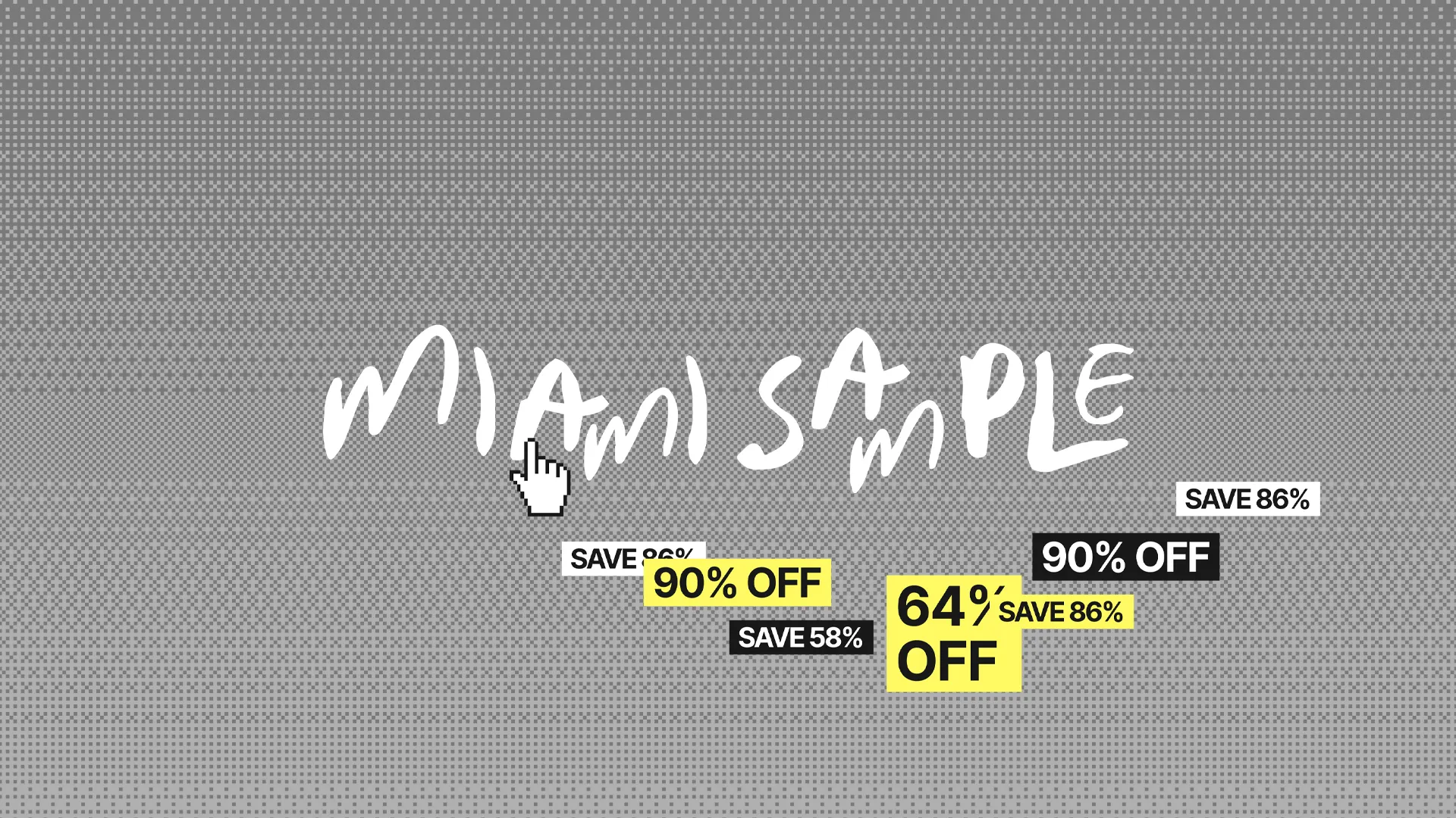
The starting point that changed everything was a new logo. A raw, brush-stroke mark that felt like a signature on a package, or a tag on a warehouse rack. From that single asset, the entire direction of the project became clear.
Reading the logo
Before touching a single color or font, we spent time decoding what the logo was actually saying. It was urgent. It was unpolished. It was honest. Three words that became the foundation for every decision that followed: Urgent. Clean. Naive.
These weren't just mood words — they became a filter. Every design choice had to pull its weight against all three.
The challenge nobody talks about
Miami Sample doesn't control their visual assets. Every brand they sell sends different photography — different lighting, different ratios, different energy. Nike one week, a luxury swimwear brand the next.
The design system needed to be a neutral, high-end container that made everything look intentional, regardless of what came through the door. That meant the site's personality couldn't live in the imagery. It had to live in the structure, the typography, and the details.
Building the visual language
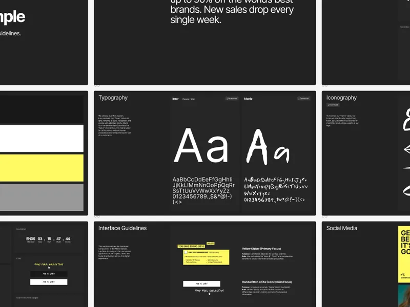
We developed a dual-font system. Inter handles everything functional — prices, navigation, product names — with industrial clarity. Manic, a handwritten font, carries the "Naive" layer. It lives in the call-to-action areas, the moments where the brand needs to feel human rather than transactional.
For color, the answer was almost obvious once we asked the right question: what color screams sale without screaming cheap? The answer was #FFF963 — an electric lemon that reads like a highlighter, a caution sign, and a Miami sun all at once. Against a strict black-and-white base, it pops without competing with any brand asset that lands on the page.
The icons followed the same logic as the logo — hand-drawn, intentionally rough, sketched to match the brush-stroke weight of the mark. Every cart, heart, and arrow is part of the same visual family.
Urgency as a design system
For a sample sale business, urgency isn't a marketing trick — it's the product. Items move fast. Sales end. The design system needed to make that feel real without feeling cheap.
Countdown timers, "Only 1 left" indicators, bold "Sold Out" states — each one was designed as part of a cohesive system with clear rules for where and how they appear. The yellow kicker only lives on savings and alerts. The handwritten font only appears on calls to action. Nothing happens by accident.
The result
A brand that feels like it belongs to Miami — fast, authentic, and confident — while being operationally designed to handle the reality of a weekly drop business. The guidelines now live in a document the client can hand to anyone: every color, every font, every icon, every rule for how urgency should be communicated.
From logo keywords to a full brand system in one focused engagement.
