Frasier Sterling
Frasier Sterling had outgrown her original site. The brand had matured, the product range had expanded into new categories, and the old design no longer reflected where she was headed.
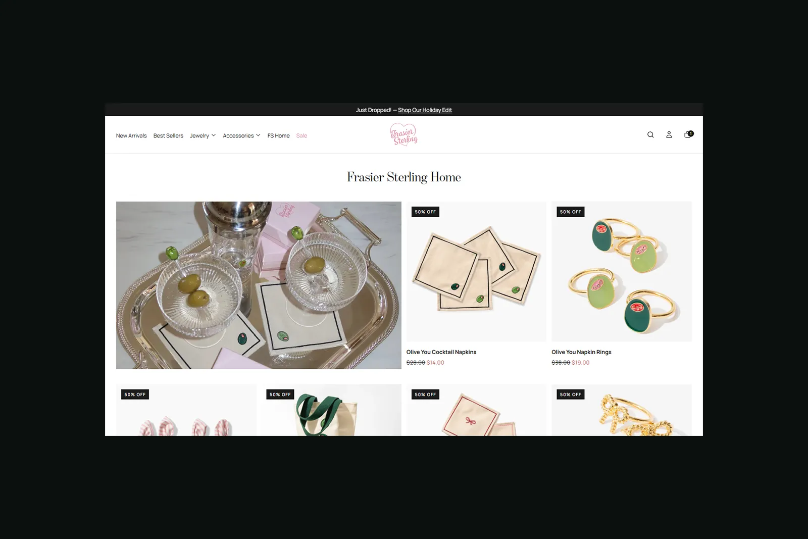
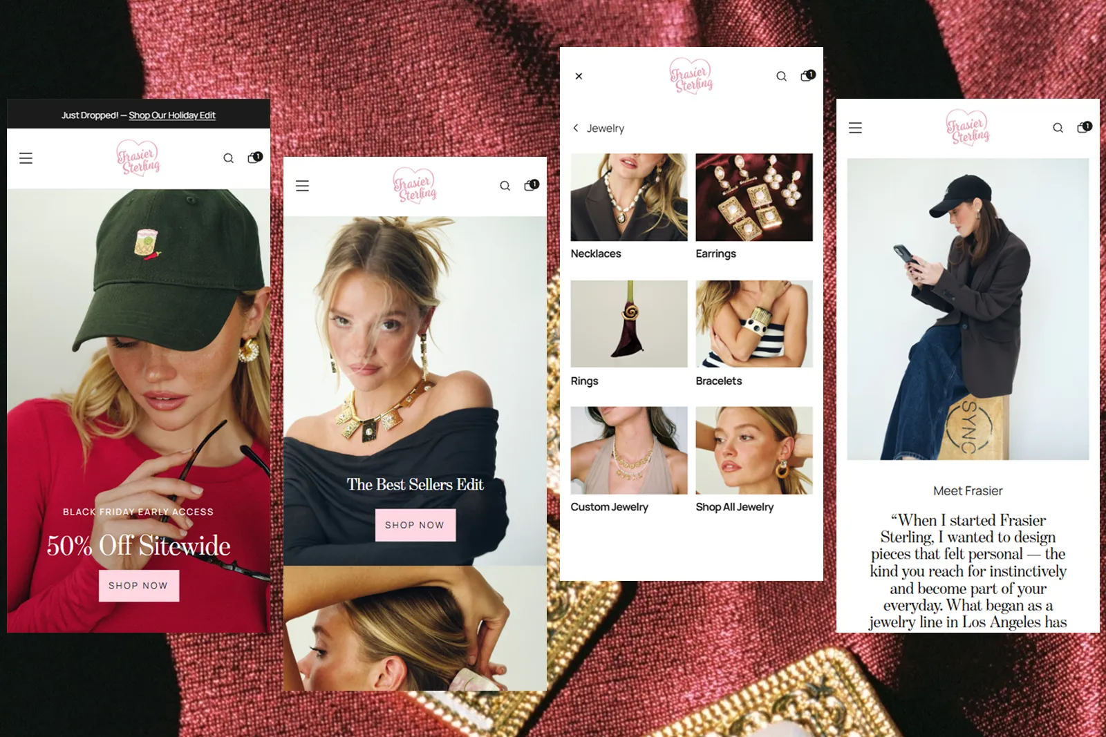
We redesigned the store from the ground up - moving toward an editorial aesthetic that felt more considered and grown-up, while keeping the navigation sharp and the user flow clean. The new category structure was planned from scratch to give each product line the space it needed without competing for attention.
Category:
Jewelry
Platform:
Shopify Plus
Information architecture
UX and user flow planning
Shopify Design
Shopify Development